As you may have heard, I have an ongoing challenge with myself to complete each page kit (assembled with photos and journaling) before the end of the month. Not to brag, but I've been successful every month since I started the challenge in January 2018. My goal is to inspire members to use their kits without letting the theme get in the way. Well, folks, I'm embarrassed to say the February Page kit threw me for a bit of a loop. I have to admit finishing my Rainy Day layouts was a bit more challenging than I anticipated. Nevertheless, I persisted. And I couldn't be happier with the results.

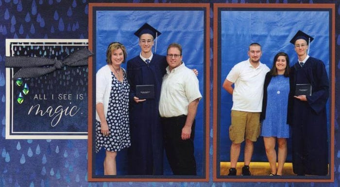
Rarely do I use all eight pages for a single event or occasion. However, in this case, I knew the colors would be perfect for my youngest's high school graduation photos. I just had to wrap my head around how to make the pages a little less "puddle-jumping" and a little more "graduation".
Rainy Day Page Kit
Layout 1 & 2
Using the cutapart on the lower left page as a mat for an extra photo allowed me to cover a sentiment that didn't fit these photos. The tall, narrow cutapart tag on the right page acts as a mat for a photo of the class motto.

Layout 3 & 4
The "All I see is magic" cutapart is the one that first inspired me to use the Rainy Day layouts for Max's graduation. From there, I just changed or eliminated sentiments that didn't quite fit the occasion.

On the right side, I flipped the oval cutapart over and added a sentiment from the Geodes stamp sheet. Isn't it nice how it ties into the sentiment on the opposite page?
We ordered a few professional prints from the ceremony. To make it work on the existing layout, mat the vertical 5x7 in ivory and center it over the two horizontal mats. It's a perfect fit!
Layout 5 & 6
On the left page, a 5x7 professional print is centered onto two horizontal mats. A vertical 4x6 photo disguises another cutapart sentiment. The cutapart tag on the right layout acts as a mat for an additional cropped photo.

Layout 7 & 8
Just a few tweaks on this two-page spread make it perfect for grad photos. Flip the nesting cutapart over and stamp a Vintage Americana sentiment on the plain side.

I utilized the plain side of the tag-shaped cutaparts on the right as well. Since Max is on the taller side (he's 6' 9"), these silly photos of him with his (short-ish) godmother make me giggle. Two tall, narrow photos were cropped to stretch vertically across a pair of mats.

I hope my Rainy Day layouts inspire you to really think outside the box when a theme has you stumped. Don't be afraid to make minor adjustments to suit your needs.
Happy scrapping!


