As soon as I saw the Creative License Remix kit, I knew exactly which photos I wanted to scrap on the pages. As it turns out, Tricia found perfect photos in her stash, too. We hope seeing our layouts, each featuring very different photos, will demonstrate just how versatile this page kit really is!
Creative License Remix Page Kit
Originally released in May of 2016, we've freshened up the color palette and original artwork to make this rendition of the Creative License theme better than ever.
Layout 1 & 2 - Karen
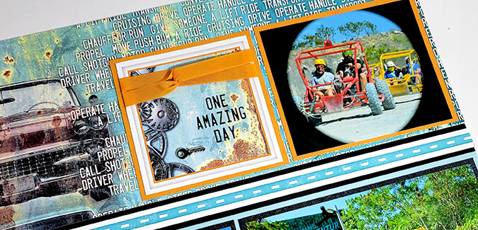
My family took an adventure tour while on vacation last summer in Punta Cana. The tour included driving dune buggies in the jungle. The bright colors in the photos coordinate perfectly with the Creative License color palette.

Our group teamed up in pairs, so this spread features pics of my oldest son, Hunter, and our friend, Troy. On the left page, I skipped rounding the corners on the smallest cutaparts. I thought the squared edges looked better with my photos.
Tricia

Tricia's photos are from a snowmobiling trip to Upper Michigan. She chose to round the corners of the small cutaparts on the left page, reinforcing the "license plate" look.
Layout 3 & 4 - Karen

Photos of my husband, Mike, and youngest son, Max fit perfectly onto this two page spread. I made a slight tweak to the arrangement of some of the elements on the right page.
Tricia

Tricia was able to tuck an additional vertical photo underneath one of the mats on the left side of her layout.
Layout 5 & 6 - Karen

In lieu of a small photo, I added two wooden arrows to the 2x2" mat on the left page.
Tricia

Isn't it neat the way the cutpart titles and sentiments are equally fitting for both dune buggy and snowmobiling photos?
Layout 7 & 8 - Karen

Since I had more horizontal photos than vertical, I rearranged the mats and other elements on the right page. Don't be afraid to change the orientation of your photo mats when needed.
Tricia

I hope you enjoyed touring our Creative License Remix layouts. I also hope the tips shared here give you the drive you need to finish your assembled pages with photos. It's time to kick that creativity into gear!


